As the research progresses, the reflection of this study shifts away from traditional approaches to design that are shaped by standardised aesthetic tropes and the discourse of data from the official narrative. Instead, the current status of this enquiry has focused on re-thinking and re-questioning the approaches, practices, and outcomes of Western positivist data visualisations, with the aim of exploring alternative practices to represent data in a particular way.
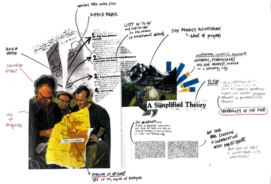
This series of three mini-exercises aims to reflect on dominant visualisations with their methods and practices. The title “A Simplified Theory” (image above) stems from questioning the conventional way of representing data, which relies on established graphical standards, abstract elements or pre-existing diagrams to achieve graphical excellence. Unlike the first two exercises, the last was intended to visualise the dataset using a completely different aesthetic, although keeping the same concept as the previous exercises.
Detail of the practice
To create the first two exercises, photographs from old Computer Graphics and expedition/travel magazines were used, combining two different graphic themes to encourage reflections through visual metaphors. The torn paper technique is maintained but contrasted with precise cut-outs to vary the rhythm of the composition. The main sections are treated in colour, while the secondary sections are presented in black and white.
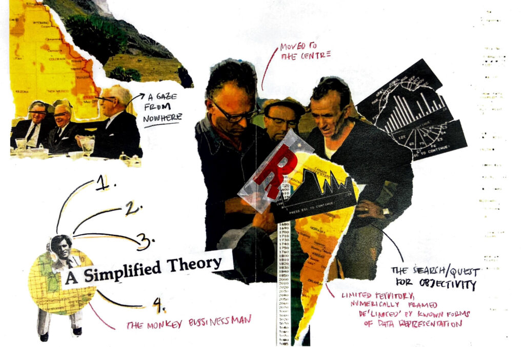
As shown above, the second exercise is the extended version of the first visualisation and has the exercise of re-presenting the same data set in alternative ways around graphic decisions, re-exploring certain graphic compositions and posing new alternatives, such as the figure of the “monkey businessman”.


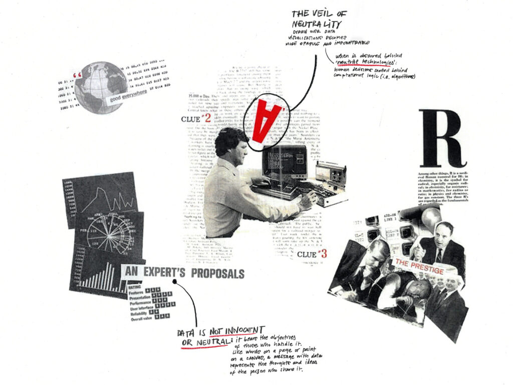
The final exercise (image below) was inspired solely by photographic archives of Computer Graphics magazines from the 1970s, depicting progress, efficiency and authority through successful men, computers, numbers and graphs. The visualisation was created on a black and white scale, with the exception of a few points highlighted in red to draw the reader’s attention through collage and annotation. In addition, the annotations were used as a method of reflection on the findings reviewed from the literature, as well as on the visual decisions made and their future opportunities for further phases of the research.